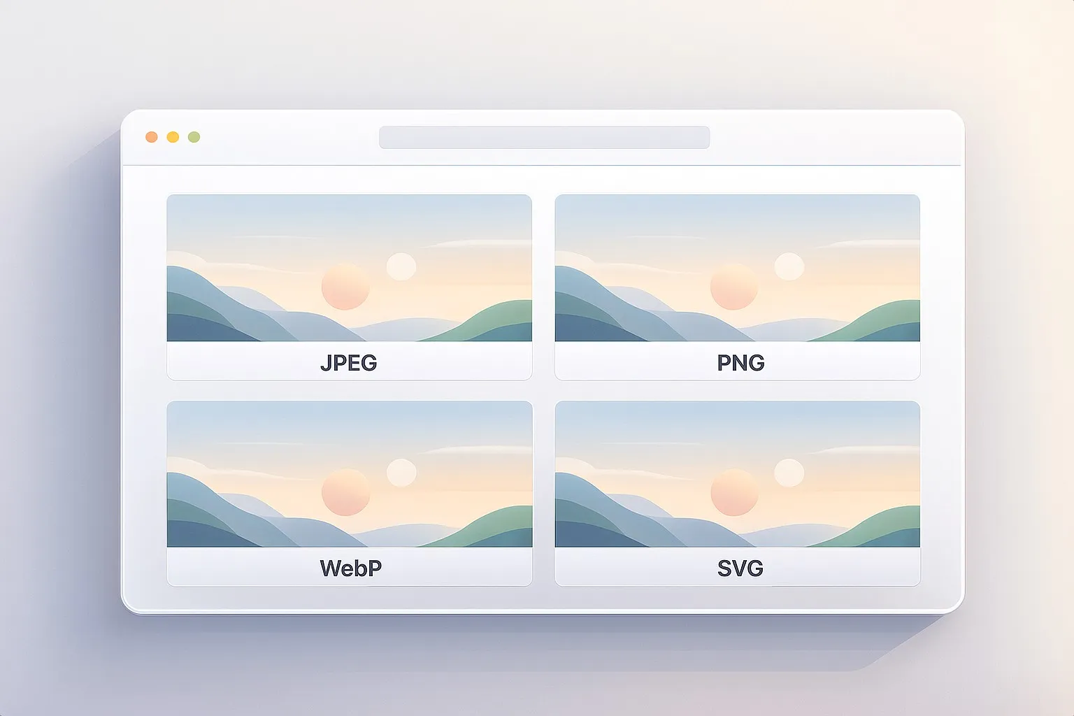
Web Image Formats Explained: WebP — The Modern All-Rounder Solution
The third part of our series on web image formats. A practical, creator-friendly guide to how WebP works, why Google built it, and when it’s the right choice for shrinking photos and graphics without losing quality.
Fri Nov 21 2025 • 7 min read
This is the third article in the series Web Image Formats Explained. In the previous part, we explored PNG — why it was created, why it stays perfectly crisp, and why it’s terrible for photographs. If you missed it, you can read it here:
👉 Previously: Web Image Formats Explained — PNG
WebP is one of those formats that quietly changed the modern web. You don’t choose it as deliberately as you choose JPEG or PNG; instead, you discover that your CMS, CDN, or image optimizer keeps suggesting it. And there’s a reason for that.
WebP tries to solve a very old tension: how do we keep images looking good while making pages load fast? JPEG and PNG answered that question for the early web. WebP answers it for a world where websites include full‑width hero photos, retina screens, responsive designs, and mobile networks that range from 5G to “barely hanging on.”
To understand WebP, let’s start with where it came from — because its story explains both its strengths and its limits.
Why WebP Exists
By the late 2000s, the web had a weight problem. Sites were becoming more visual, mobile usage was exploding, and browsers were trying to render larger images on smaller devices without draining battery or waiting forever.
At the same time, Google was pushing a simple message: a faster web is a better web.
They introduced PageSpeed, Lighthouse, AMP, and countless performance papers — all pointing to the same bottleneck: images were the biggest, slowest resource on almost every page.
JPEG and PNG were reliable, but they were created decades earlier. They weren’t designed for responsive layouts, high‑density displays, or the sheer amount of imagery modern websites use.
Around 2010, Google unveiled WebP (which stands for Web Picture) — a new format built from technologies inside the VP8 video codec. This was significant: instead of compressing images like still photos, WebP borrowed techniques used in video compression — prediction, block transforms, and smarter entropy coding.
The goal wasn’t to replace JPEG or PNG in every situation, but to offer a format that:
- could shrink photos more efficiently,
- could handle crisp graphics better than PNG,
- supported transparency,
- and decoded quickly enough for the modern web.
WebP was Google’s attempt to create a new “default” image format — one that took the best ideas from both worlds and left behind some of their weaknesses.
How WebP Compression Works
The easiest way to understand WebP is to stop thinking of it as a single, rigid file format and start thinking of it as something more flexible — an image format with two personalities. It can behave like JPEG when you want small, photographic images, or like PNG when you need crisp graphics without losing detail. That’s why you often see WebP recommended everywhere today: it adapts.
But underneath that flexibility is a surprisingly elegant idea borrowed from video technology. WebP is built on the VP8 video codec — which means it treats images less like photographs and more like tiny, self-contained video frames. And that gives it tools JPEG and PNG simply never had.
A Prediction-Based Approach
Imagine you’re painting a wall. If you know the wall is mostly blue, you don’t need to explain every inch of it — you only need to point out where it isn’t blue.
That’s essentially how WebP works.
Instead of describing every pixel from scratch, the encoder looks at the surrounding pixels, predicts what the next area should look like, and then only stores the parts where the real image differs from that prediction. It’s a small shift in thinking that saves a lot of space.
For photos — where patterns and soft gradients repeat — these predictions tend to be very accurate. The encoder rarely has to store much extra information, which is why WebP files often end up noticeably smaller than their JPEG equivalents.
Lossy WebP (for Photographs)
When you use WebP in lossy mode, you’re essentially giving it permission to simplify parts of the image as long as the result still looks the same to the human eye.
Where JPEG takes a more rigid, block-based approach that can leave behind harsh artifacts, WebP’s predictions and residual corrections allow it to be gentler. It blends edges more gracefully, smooths out gradients without introducing banding, and generally avoids the classic “compression footprints” JPEG is famous for.
In practice, this means:
- a blog post with ten photos downloads faster,
- your hero image doesn’t weigh down the first load,
- and your product photos can be crisp without being heavy.
You don’t need to think deeply about it — the format simply squeezes more efficiency out of the same visual input.
You can compress all of your WebP Images using our Image Compressor
Lossless WebP (for Graphics)
Lossless WebP is the opposite approach. Nothing is thrown away. Instead, WebP focuses on rearranging the data so it can be packed efficiently.
It looks for tiny structures and repeating shapes, applies reversible transforms that expose even more repetition, and then packs everything tightly. If PNG is a carefully folded map, WebP lossless is the same map folded by someone with better technique and a more compact suitcase.
For interface graphics, icons, small illustrations, or exported design assets, the difference can be significant. You get the same perfect precision you expect from PNG, often with noticeably smaller files.
Built-In Transparency
A subtle but important feature: WebP supports transparency in both its lossy and lossless modes.
This means you can have:
- soft shadows,
- semi-transparent overlays,
- or logos that sit cleanly on any background
without being locked into PNG. You get flexibility without the usual penalty of file size.
When WebP Works Well
WebP shines whenever you want to reduce file sizes without sacrificing quality — which, for most sites, is almost always.
Images that naturally benefit from WebP include:
- photos used in blogs or articles,
- hero images and large banners,
- product images,
- illustrations with gentle gradients,
- UI elements that don’t require pixel‑perfect preservation.
But WebP isn’t a magic fix. Its value depends on the type of image — and on your expectations.
Where WebP Falls Short
Despite its flexibility, WebP has boundaries.
It’s not the ideal format when:
- you need pixel‑perfect brand assets (PNG or SVG will look cleaner),
- your audience includes older browsers (increasingly rare, but still a factor),
- you need heavy editing iterations (lossy WebP degrades if re‑saved repeatedly),
- you need animation but not at large file sizes (GIF is more compatible, MP4/WebM is more efficient).
WebP aims to be a middle ground — not a perfect replacement.
How WebP Fits Into a Modern Workflow
Most creators approach WebP like this:
- Start with a clean PNG or JPEG.
- Convert it to WebP.
- Adjust the quality until it feels right.
- Compare both versions visually.
- Use fallbacks only if older browsers matter.
This workflow is simple, predictable, and produces small files without complicated tooling.
The Bigger Picture
At this point in the series, each raster format has a clear personality:
- JPEG keeps photos light.
- PNG keeps graphics crisp.
- WebP blends the strengths of both in a way that fits modern performance needs.
You can convert your images between all those formats in one go using our Image Converter
But there’s a fourth major format — and it isn’t based on pixels at all.
In the next article in Web Image Formats Explained, we’ll explore SVG, the vector format that stays sharp at any size and often weighs less than a tiny PNG.
If WebP optimizes pixels, SVG removes them from the equation altogether.