Halftone dots, the right way (private, in-browser)
Halftone is the classic printing trick that turns continuous tones into patterns of dots. This tool creates that look from a single photo—fast, high-quality, and fully client-side:
- Dot Spacing (density)
- Dot Size (maximum dot radius)
- Dot & Background colors
- 45° screen for a print-style grid
- Invert luminance (flip what becomes ink)
- Colored dots (sample your image for a comic/pop-art feel)
- Surprise me palettes for instant creative looks
No uploads. No accounts. Your image stays on your device.
Workflow & usage
-
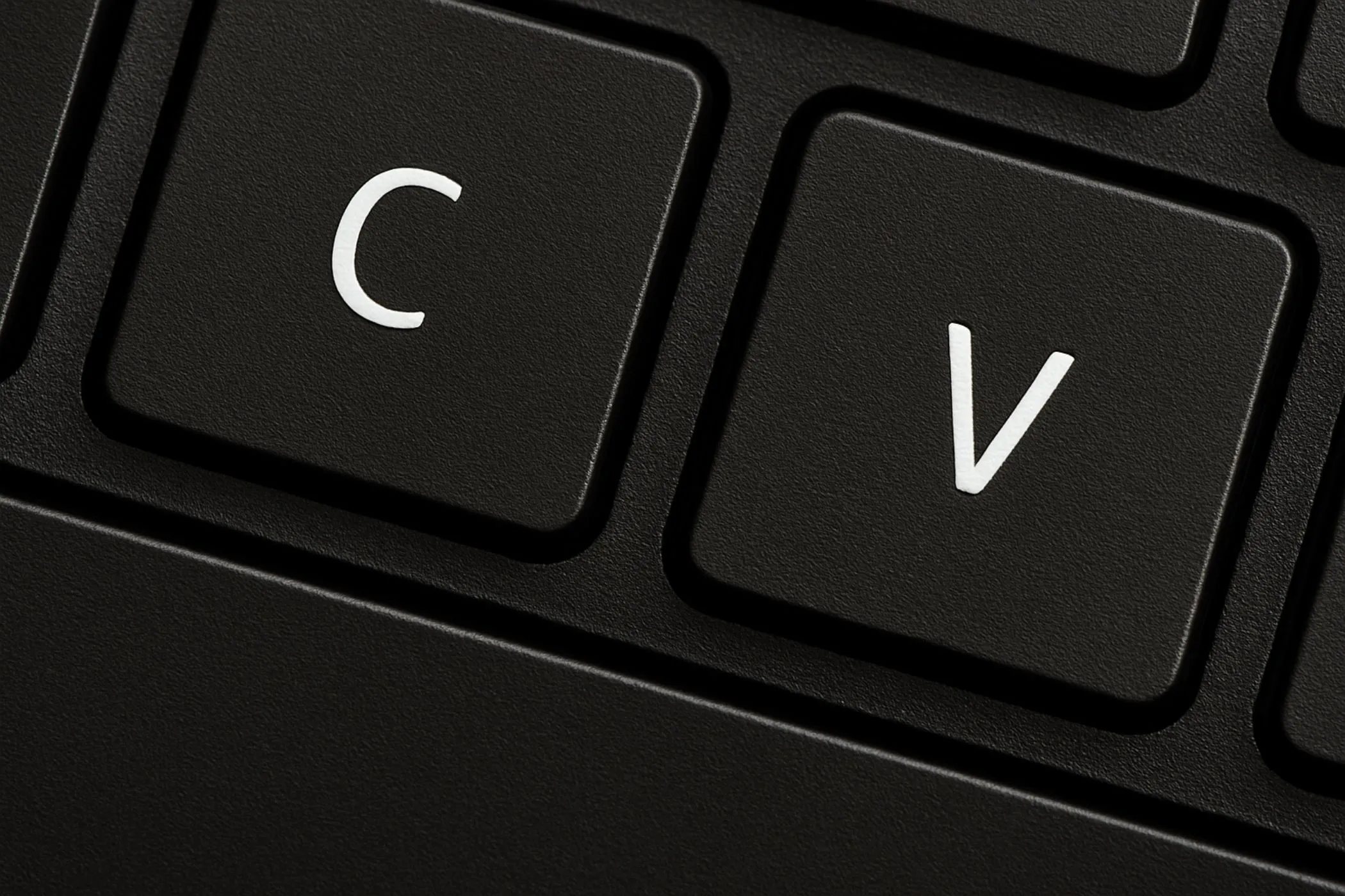
Add an image Drag & drop, click to select, or paste (Ctrl/⌘ + V). EXIF orientation is respected.
-
Choose your dot style
- Start with 45° Professional ON (recommended).
- Set Spacing first (density), then Size (boldness).
-
Pick colors
- Choose Dot color (ink) and Background color (paper).
- Toggle Colored Dots if you want dots to carry the image’s colors.
-
Optional tweaks
- Invert Luminance to flip ink mapping.
- Hit Surprise me for curated palettes + settings.
-
Download Export at full resolution in the same format as the original file.
What is halftone?
Halftone is a technique used in print (newspapers, comics, screen printing) to represent shading using dots. Darker areas get larger/more dominant dots; lighter areas get smaller dots (or none).
Why dots?
Printing presses (especially historically) couldn’t reproduce smooth gradients easily. Halftone converts gradients into a dot pattern that your eye blends into “continuous tone” from a distance.
Halftone vs dithering
- Halftone: usually round dots on a regular grid; looks like print/comics.
- Dithering: spreads error across pixels; more “pixel art / retro computer” look.
If you want a classic magazine/comic texture, halftone is the one.
Where halftone is used
Comic & illustration looks
- superhero-style portraits
- manga/comic shading texture
- posterized pop-art vibes
Print & merch design
- screen printing / risograph-inspired textures
- t-shirt graphics and sticker designs
- “ink on paper” aesthetics with custom paper colors
Branding & social content
- consistent halftone thumbnails
- album covers and event flyers
- bold monochrome themes
UI / product visuals
- background textures with controlled density
- subtle dot patterns for hero sections
Controls explained (practical + deep)
Dot Spacing (density)
Spacing is how far apart the dot centers are.
- Lower spacing → more dots → denser, more detailed, more “ink”
- Higher spacing → fewer dots → chunkier, more stylized
Rule of thumb:
- portraits: 8–16
- pop-art posters: 14–24
- abstract / chunky: 20–40
Dot Size (maximum radius)
Dot Size controls how big dots are allowed to get at the darkest areas.
- Small size → delicate print texture
- Large size → bold, graphic look
Tip: keep Size roughly 0.6× to 1.2× Spacing for a balanced pattern.
Dot color (ink) and background color (paper)
These define your “ink on paper” look.
- classic newspaper: dark ink + off-white paper
- blueprint style: cyan paper + dark navy ink
- risograph vibe: warm paper + deep ink
45° Professional
Rotates the dot grid by 45° (classic halftone screening).
Why it looks better:
- reduces obvious “square grid” feel
- closer to traditional print screens
- often looks more natural on faces and gradients
Colored Dots
When ON, each dot color is sampled from your image (instead of a single ink color).
Use it for:
- pop-art
- vibrant comic looks
- halftone photos that keep color identity
Use single-color dots for:
- newspaper / classic print
- clean branding assets
- consistent monochrome designs
Invert Luminance
Flips the mapping of brightness to dot size.
- normal: dark areas → big dots
- inverted: light areas → big dots
This is great for:
- negative-style looks
- bright-on-dark designs
- mask-like compositions
Quick presets (copy these settings)
Classic newspaper (mono)
- 45° Professional: ON
- Colored Dots: OFF
- Dot color: #111827 (dark ink)
- Background: #ffffff or #f7f3e8 (paper)
- Spacing: 10–16
- Dot size: 8–14
Comic pop-art (color)
- 45° Professional: ON
- Colored Dots: ON
- Background: bright pastel (try Surprise me)
- Spacing: 12–22
- Dot size: 10–18
Bold poster (chunky)
- 45° Professional: ON
- Colored Dots: OFF
- Spacing: 18–32
- Dot size: 16–28
Inverted neon on black
- Background: #000000
- Dot color: bright (e.g., #22c55e, #60a5fa, #f472b6)
- Invert Luminance: ON
- Spacing: 10–18
- Dot size: 8–16
Tips for best results
-
Change spacing first, size second. Spacing defines the pattern; size defines how bold it becomes.
-
Use 45° for photos. It usually looks better on skin tones and gradients.
-
If dots look noisy, increase spacing slightly. Very small spacing can exaggerate texture in already-noisy photos.
-
Pick a “paper” color instead of pure white. Off-white backgrounds often feel more authentic.
-
Try “Surprise me” then fine-tune. It’s a fast way to discover palettes you wouldn’t have chosen.
-
Optimize after export Run results through Image Compressor or Progressive JPEG Converter for production-ready sizes.
How it works (technical, but readable)
- Decode locally (browser image decoders + EXIF orientation).
- Draw the image to a working canvas and read pixels.
- Build a dot grid across the image (optionally rotated 45°).
- For each grid cell:
- sample the underlying pixel color
- compute luminance (perceived brightness)
- map luminance to dot radius using a gentle curve (for smoother shading)
- skip tiny dots for speed/cleanliness
- Paint circles with anti-aliasing for a crisp look.
- Export at full resolution in the original file format.
Why there’s a curve (and what it does)
Halftone can feel harsh if dot sizes change too linearly. A curve makes midtones smoother and keeps highlights cleaner.
Preview vs final quality
The preview is rendered at a capped resolution for speed, then scaled to fit the dropzone. Download uses the full original resolution.
Quality, privacy, and limitations
Privacy-first
Your image never leaves your device.
Notes about transparency
- Transparent pixels don’t generate dots.
- The final image is rendered on your chosen background color (so the output is always visually consistent).
Limitations
This is a single-screen halftone look (one dot layer). Traditional CMYK printing uses multiple screens (different angles per channel). For most web/graphic use, a single high-quality screen is the desired look.
Troubleshooting
-
The pattern looks too busy / gritty Increase Spacing or decrease Dot Size.
-
The image loses detail Reduce spacing (denser grid) and/or reduce dot size slightly.
-
Dots look too faint Increase dot size, or choose a higher-contrast dot/background pair.
-
I want the dots to match the original colors Toggle Colored Dots ON.
-
The result looks like a square grid Turn 45° Professional ON.
Glossary
- Halftone: shading using dot patterns.
- Screen angle: rotation of the dot grid (45° is classic).
- Luminance / luma: perceived brightness computed from RGB.
- Anti-aliasing: smoothing edges to avoid jagged circles.
